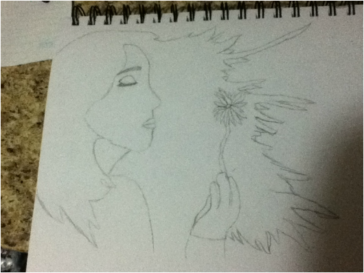
For work # 2 I will be creating a work similar to this sketch in my sketchbook. It is of a girl blowing on a dandelion. When the dandelion is a white (like in the picture), it represents intelligence, clarity, purity, cleansing, spirit/soul, space and new beginnings. The girl is trying to forget her past (this is why her eyes are closed) and start a new beginning (the dandelion represents this).
I will be cutting paper from magazines (because magazine paper will give a glossy look to the artwork), in various shapes, mostly triangles.
The colors that I will be using are:
- Black (for the background, eyelashes, and eyebrow and a small portion of the hair)
- White (for the dandelion)
- Pink (for the lips)
- Light Pink (for the palm of the hands)
- White (for the face and hand)
- Green (for the stem of the dandelion)
- Orange and Brown (for the hair)
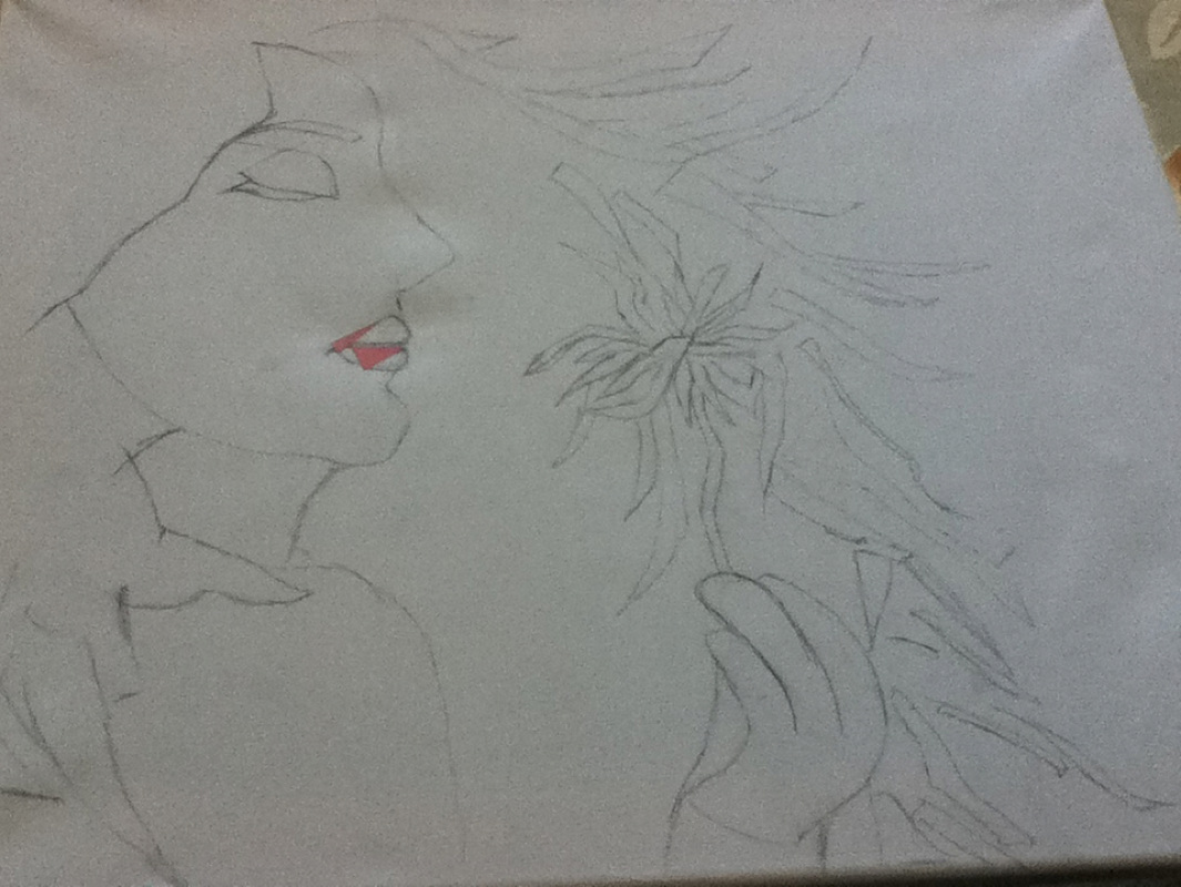
I have transferred my initial sketch from the sketchbook to the canvas. I have also started adding some pink pieces to the lips. However, looking at it now (too late to change anything since it is glued down already) I think i should have used smaller pieces for the lips. The next time that I continue to work on the lips I will use smaller pieces.
In addition to using magazine paper (I choose this medium because it will give a glossy look to the art), I am thinking of making small circles and designs using paper quilling. Furthermore, I was also thinking of adding the paper quilling to the sides of the canvas (instead of covering it with magazine paper).
In addition to using magazine paper (I choose this medium because it will give a glossy look to the art), I am thinking of making small circles and designs using paper quilling. Furthermore, I was also thinking of adding the paper quilling to the sides of the canvas (instead of covering it with magazine paper).
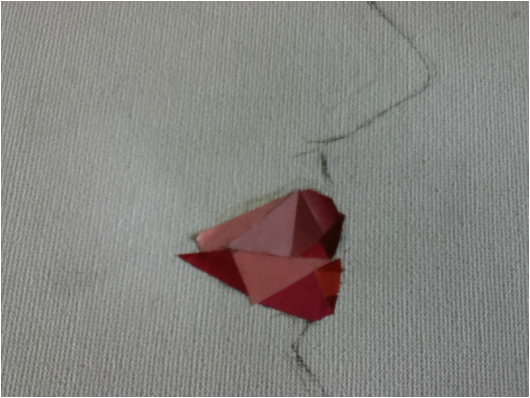
This is an extreme close-up of the lips. I have used various shades of light pink, dark pink and a sort of reddish pink. When first starting the lips I used two very big pieces (which i regretted later), however I have fixed that because after I have started to use smaller pieces.
The edge of the lips, I added one piece that was very sharp so that the end of the lips is very clear and so it adds a bit of a realistic effect.
The most challenging part of doing the lips was the round part, I had to add very tiny pieces and they had to fit perfectly with the other pieces, while at the same time making the lips appear round.
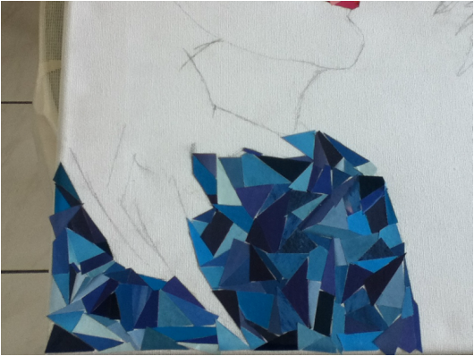
This is the girl's t-shirt, which is composed of various shades of blue and mostly triangles (although there are also other shapes).
Unlike the lips, where each triangle is individual and the pieces fit together perfectly like puzzle pieces, the shirt has some triangles over-lapping.
As can be seen, the shirt is a little cut off, this is because the girl's hair covers a part of the shirt. This is not as visible now because I have yet to complete the hair, however, when I am complete everything will fall into place. The majority of the artwork is the girl's hair, this is because the wind is blowing her hair, causing it to fan around her face and spread out.
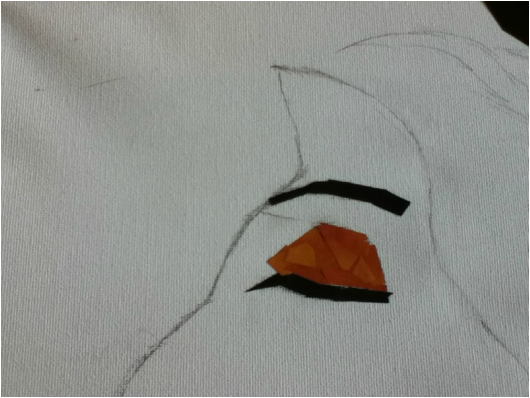
This is the eyelid and the eyebrow of the girl. Similar to the shirt the triangles are also over-lapping each other on the eyelid, eyelashes and the eyebrows.
I decided to make the girl close her eye because it shows that she is reflecting and thinking and living in the moment. Sometimes the best things are felt by the heart instead of living it through the eyes.
The eyelid is a really dark color, I think that instead of having just one color, I should have added a variation and different shades so that the eye-lid does not look dark and consistent. I really like the color variation of the lips, because it gives a nice effect and I feel as if I should have done something similar with the eyelid as well.
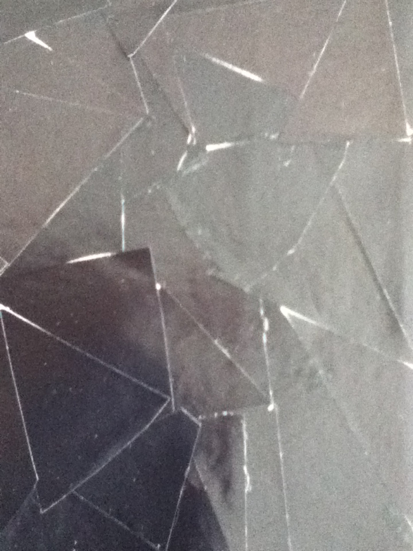
This is an extreme close-up of the background. I decided to use black for the background because I thought it would make the other colors pop out and also because later on I will be using paper quilling to make the circles, the paper quilling designs will cover most of the background (the background) and so not much of it will be visible. Also the bright colorful paper of the circles will also pop because of the black background.
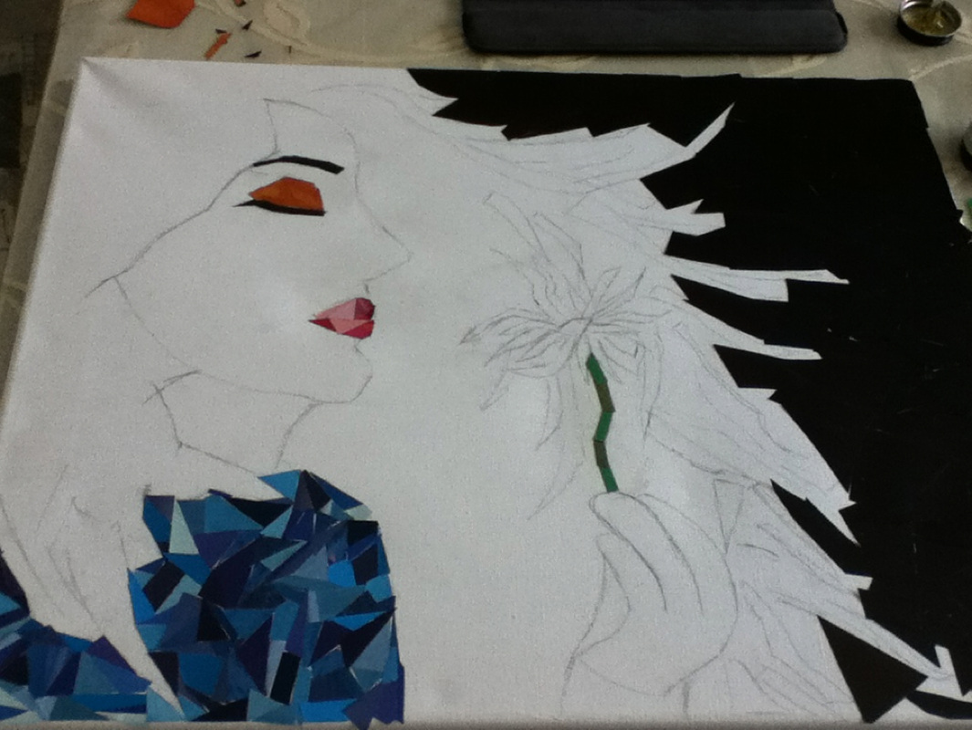
In this picture, I have completed the background (the rest of the background will be covered by the hair), shirt, lips, eye, and the stem of the dandelion.
As can be seen (upon closer inspection) there are some spaces between the triangles (and the other shapes), this is because I thought it would give the artwork a more of a mosaic feel. When I was researching and looking at examples of mosaics I noticed that most of them had spaces between them and this added to the effect instead of making the artwork seem weird.
For the stem of the dandelion I have used two shades of green-light and dark green.
I still have to complete the hair, face, dandelion, and hands. I think the hair will take the most time because it covers the majority of the canvas.
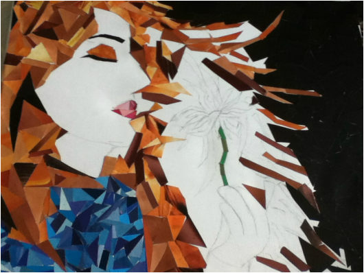
In this picture I have completed most of the hair, and I have started to add the strands of the hair (that is being blown by the wind).
I think that the orange, works really well with the black. I chose orange as the hair color because brown blends in with the black background (I observed this when gluing the strands down, this is why I chose not to add too much brown close to the black).
Another reason is because the majority of the work is covered by the hair and if I had chose brown then it would seem a bit dull, I think that the orange adds life to the artwork. Also, instead of taking attention away from the artwork (like brown would have), it gives attention and makes the viewers eye catch on to the hair first).
In this picture I have completed the hair (finally) and the top part of the dandelion. I decided to add some long pieces in the hair so that it actually looks like strands. In addition, I have also included pieces that contain hair (from hair product ads from the magazines) so that it gives the hair more of a realistic effect.
Despite this, the majority of the colors used for the hair is orange (with bits of black and brown), because when doing the strands of the hair I realized that the darker brown blends in with the black background and it becomes hard to distinguish between the background and the hair.
This is one of the reasons why I have not added many pieces that were from hair product ads. When sketching this, however, using hair product ads for the girls hair was my first idea but slowly i realized that this would not work well with the other colors I had chosen.
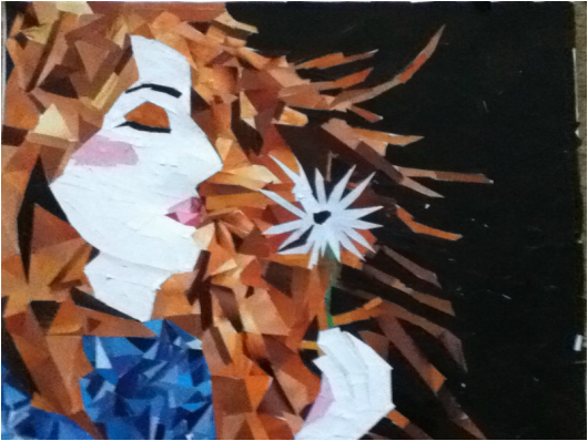
This is the finished product of work # 2!
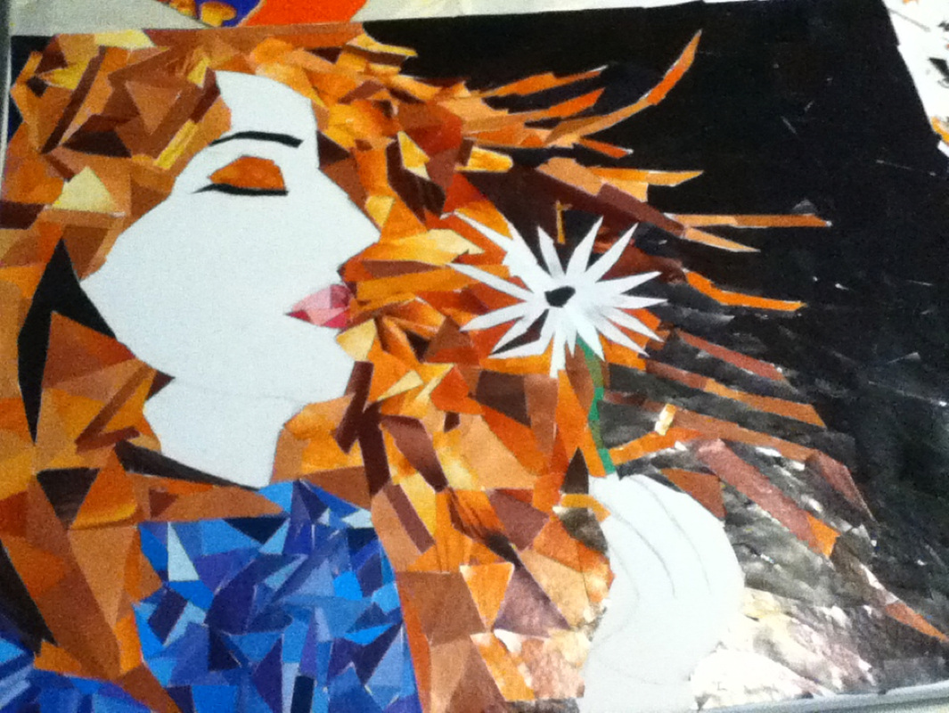
Since my last update, I have completed the face, the neck and the hand. For the hand I have used pink, because it shows that it is the palm of the hand. If I had continued with the white for the palm of the hand also then it would have been difficult to distinguish.
I have also used pink for the cheek, this is because it makes it seem like the cheek is blushed and it is also adds more color to the face. I was hoping for a more lighter shade of pink and I feel that the white of the face makes it stand out more and it makes it appear less subtle than I had intended it to be.
It is hard to believe that I am finally done work # 2! It seems like a long time ago since I started this work, it was a lot of work and a lot of effort was put in to this piece. I am really happy with the outcome and I really like how the piece has turned out. While working on the artwork I did not imagine that it would turn out this good.
