The sun and the moon are very important in our lives, without the sun we would have no life. Perhaps this is the reason for me choosing to do this.
The sun and the moon represent many things in different cultures. However, it can be agreed that the sun represents a masculine figure, signifying strength and power, whereas the moon represent a feminine figure, signifying calmness and stability.
The sun and the moon joining together symbolize the union of opposites. With the sun being the active principle and the moon being passive principle, both joining together is similar to a yin or yang symbol. They represent, that where there is good there is also bad, nothing in the world is perfect. As the sun rises and sets everyday, every person has his days of glories and nights of darkness in his life.
However, separately, these symbols still carry a lot of strength.
The sun stands for lights, power, strength, vigor, fertility, reincarnation and harvest. The sun has been worshiped since a long time ago, this is because there can be no life on earth without the sun.
The moon stands for motherhood. The moon was worshiped even before the sun was worshiped. It is believed to control the emotions of human beings. The phases of the moon were noted by the ancients to have a direct affect on Earth. The moon's gravitational pull governs the tides, and the distinct phases were used to create the first calenders. In fact, some cultures and religions still follow the lunar calender.
It was really challenging to match the lines up with the four canvas. This is because, i would draw and then try to continue to the next canvas and then when i matched them up later, the drawing did not match up.
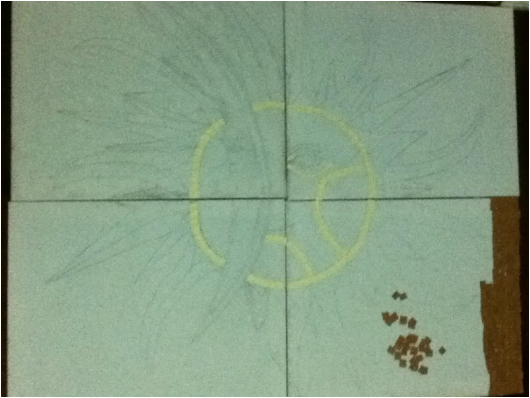
In this picture I have transferred my sketch to the four canvas. I decided to make the last piece on four canvas, because I wanted my last work to be the largest and also because it was a mosaic within a mosaic. Meaning that the piece is a mosaic, and also the fact that it is on four canvas is a mosaic within itself.
I have started to add the pieces, the yellow seems really bright, but in fact it is lighter than construction paper. In the card-stock, the yellow is a nice, soft shade. However, this is fine because the sun is really bright and yellow and i can portray this through the color.
In the package that contains the card-stock, there are five different colors- white, yellow, lighter brown, light brown, and dark brown. I decided to use the lightest shade of brown for the background because, I think i should use the others for the sun itself. The darker shades against the lighter background will make the sun and the moon stand out more.
I have also started on the background, The corner is what i have actually glued, whereas the scattered pieces are just that and will soon be glued down. Looking at it altogether, it seems like a lot of work, and looks like it will take forever. Despite this, when I started gluing the pieces down, it did not take as long as i expected.
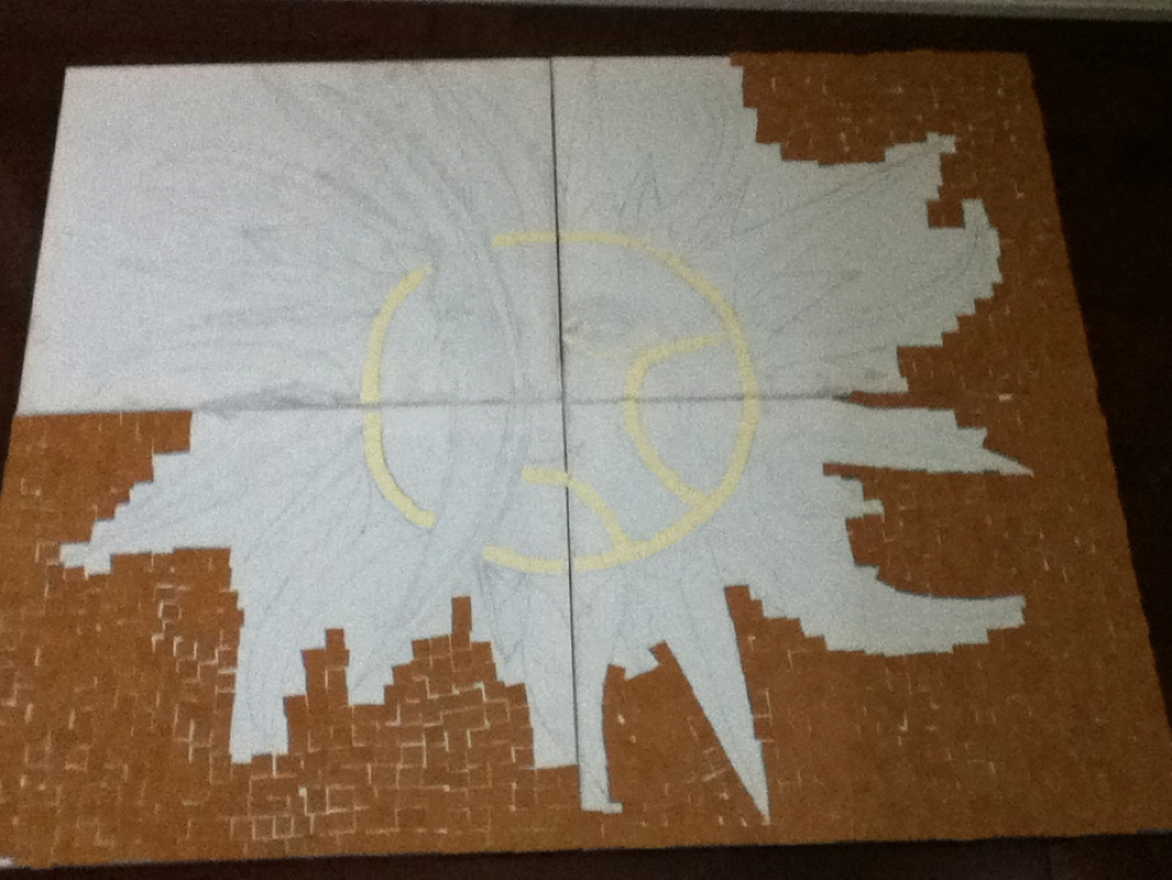
Here, i have completed most of the work. This did not take a long time as i am just placing the pieces and i do not have to follow a line or place them in a certain way. I also do not have to worry about the color.
As can be seen there are a lot of spaces between the pieces, but i like the effect it gives. I feel that with the spaces it makes it look more mosaic.
Even though it seems like a lot is done, the finer details are still left to be done and this will take even longer than this because i have to be more careful about where i place the pieces and also i think i might have to overlap so there are not as many empty spaces.
I have yet to decide which color to do the sun and the moon. I think for the face (or inside) of the sun I will use the same color as the background. However, for the rays I was thinking of using a light shade of brown (different from the background), black and dark brown.
For the moon I was thinking of using dark brown and outlining it with black. Since I have no black in my card-stock package I might use Bristol board, but I do not want it to stand out and make it obvious, so I will see.
I feel as though that drawing, and cutting the pieces takes longer than actually placing them and gluing them. So, because of this, I think I will spend time first cutting them and then gluing them down. (So, cutting two or three sheets of paper for one color and then gluing them down)
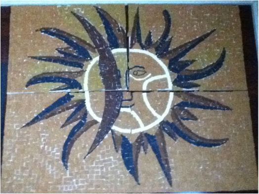
I have finally completed the work!
Since I chose the lightest shade of brown for the background, I did the next lightest shade for the sun rays and I used this color beside the black. Then I added the dark brown. I did it this way because I was afraid that the light shades of brown would blend in with the background and so I added the dark brown as a sort of barrier.
I am glad that I did it this way because it stands out more and I feel if I did the dark brown and black next to each other then they would sort of blend in and it would be hard to tell them apart.
In the card-stock package that I purchased, there was no black, so because of this I used black Bristol board and I think it blended in well with the card-stock. I was a bit hesitant at first, with using the black Bristol board, but I am glad I did, because it fits in so well with the card-stock that it is hard to distinguish which is Bristol board and which is card-stock.
While doing this, I was a bit unsure as to whether or not this will turn out the way I wanted it to, and I kept having doubts. However, now that it is completed I can see that all of my hard work has paid off, and I am very happy with the results.
All that is left now is for the art show to take place, can't wait!
